Tuesday, 20 April 2010

Main article


Contents page


I am submitting this as my contents page. Once again I have maintained the use of three colours.

Front cover


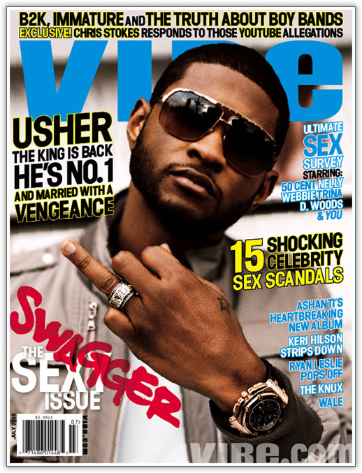
This is the front cover I am using for my music magazine. In comparison to the previous front cover I uploaded, I have opted for another model, changed the style for the sell line, moved the barcode, added a price, placed an issue number and I also changed the composition of the tie in.

All around I believe that this front cover is better than the previous one. I have consistently maintained the use of three colours

Sunday, 11 April 2010

Message from Ms Prince

Your blog has now been marked for research and planning. Any subsequent evidence of research and planning work will not count towards your final grade.

Urgent Message

Joey, you have not uploaded your contents page or your two page main article. You must do this as a matter of urgency BEFORE moderation day on the 19th.

Wednesday, 24 March 2010

Monday, 22 March 2010

Production Log

I plan on taking a series of pictures of artists I plan on using for my magazine. With these pictures I plan on completing my front cover and contents by the 24th.

Front cover progress


So far I have managed to partially complete my front cover. I have finalised the colour scheme which I shall be using. Also, with the introduction of this temporary image, I have an understanding on the composition of key devices.

Research and planning (part 4)

Another analysis on a magazine contents page

Research and planning (part 3)


Here is a brief analysis of a Hip Hop

Friday, 19 March 2010

Research and planning (part 2)


XXL, quite a fitting title for this magazine as it is based on the hip hop genre; fast paced, flashy, large demographic. White text are laid on a red background, the colour red is eye catching, meaning people will be able to spot this magazine. Also the red may be symbolic, connoting the ‘red carpet’; stardom. The white contrasts perfectly with the background making the logo truly stand out. The text is bold and rounded off, rather plain, giving it a simplistic look.

Contents (progress)


Here is a print screen of the progress I have made with the contents page of my magazine. I have not actually put any text on the page as of yet but I have created a layout of where everything is going to go


  • the red areas represent the postition of future pictures which are going to be displayed on the contents

  • the black areas are simply where I plan to place my sub headers.

Research and planning (part 1)


  • Here is evidence of research and planning, as I am tackling the hip hop genre I thought a magazine such as 'VIBE' would be suitable to gain an insight on the conventions and styles of currant hip hop magazines.
  • Bold typography with a solid colour creates an inviting aura

Progress with my front cover


I am still experimenting with different styles for my front cover. So far I have opted for a completely different colour scheme, primarily red, black and white. Also, I have created a new logo from the previous front cover I uplpoaded.
The above is a print screen, evidence of said progress.

Thursday, 18 March 2010

Mock up


Here is my first attempt for my front cover. This was discarded as I opted for another colour scheme and different techniques.

Wednesday, 10 March 2010

Questionnaire analysis

1. (What gender are you?) A simple closed question, so I can gauge the different preferences from the two genders

2. (How old are you?) Another simple closed question allowing me to compare the preferences between the different age ranges.

3. (What is your ethnic background) I chose this question in order to see which ethnic background particularly enjoy my magazine’s music genre.

4. (What music genre do you listen to?) Closed question to highlight which music genre is quite popular with today’s society.

5. (Is there any particular artist or band you are interested in?) Here is my first open question, which I used in order to see which artist/band may be particularly popular with the people who were taking this questionnaire. With this information I could possibly select adequate artists to accompany my artist of choice, in the magazines sell lines.

6. (How much are you willing to spend on a music magazine?) This question allows me to successfully judge at what price I should be looking to sell the magazine. I the price is too high for my upcoming magazine customers may be discouraged to buy.

7. (What kind of tie-ins (freebies) would you particularly want to receive from a magazine?) I am looking to introduce a tie-in with my magazine, and I wanted feedback from consumers in order to satisfy their ‘wants’.

8. (What magazine have you bought recently?) I chose this question so I would have an idea of the presentation style I should consider incorporating in my magazine, be it mature and formal or sleek and stylish, plus, the style of the interviews reviews etc.

9. (How frequently do you buy music magazines?) This gives me an insight on the customers purchasing pattern.

10. (What features draw you when reading a music magazine?) My final question, closed, with this information I can hopefully entertain my target audience with the adequate features necessary.

Preliminary Task


Here is evidence, that I carried out my preliminary task. A simple design, for a school newsletter.

Tuesday, 9 March 2010

Targets

Joey, it is good to see some evidence of work in progress and examples of your planning work i.e. your masthead designs. However there are several items missing from your blog and you are falling behind. You MUST now work through the blog checklist and upload all evidence of planning and research work.

Monday, 8 March 2010

This is the layout for my front cover.


Grey: Puff
White: Logo
Purple: Sell line
Green: Main image/ Focal point
Red: Main article
Blue: Tie in
Black: Block background
Orange: Barcode

Here are four different designs of my magazine’s logo.


‘SWARVE’, this is the name I have decided as the name of my hip hop magazine. SWARVE is the colloquial spelling used for suave; displaying smoothness and sophistication in manner or attitude. I chose suave in order to contrast to the negative connotations associated with the hip hop genre, so to be unorthodox. Also, I wanted suave to represent the magazines standards when it comes to delegating the music world’s news.

Friday, 5 March 2010

Questionnaire

1. What gender are you?
Male Female
2. How old are you?
13-15 16-20 21+

3. What is your ethnic background?
White British/Irish
Black British/African/Caribbean
Asian British
Asian
Other

4. What music genre do you listen to?
Hip Hop
R&B
Garage
Rock
Heavy Metal
Grime
Classical
Other
5. Is there any particular artist or band you are interested in?

6. How much are you willing to spend on a music magazine?
£1 - £2
£2 - £3
£3 - £4

7. What kind of tie-ins (freebies) would you particularly want to receive from a magazine?
Poster
CD
T-shirt
Other
8. Which music magazine have you recently bought?
NME
XXL
VIBE
Q
Other
None

9. How frequently do you buy music magazines?
Weekly
Monthly
Rarely
10. What features draw you when reading a music magazine?
Photos
Interviews
Reviews
Other